 Timestamps, for the Mac menu bar
Can I ping them now?
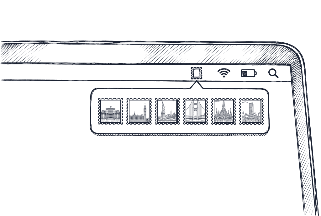
Six cities under their real sky right now. Open one, or drag the ruler.
I work remotely, with people spread across many time zones. I also hate (read: I’m not great at) doing maths in my head.
There are a ton of apps out there, but I wanted one thing from a time-zone app: can I ping someone now? So I set out to find a quick and nice way to do just that.
This is how I built this small app in two days.
How it works.
Recorded on the real app, on a Friday morning.
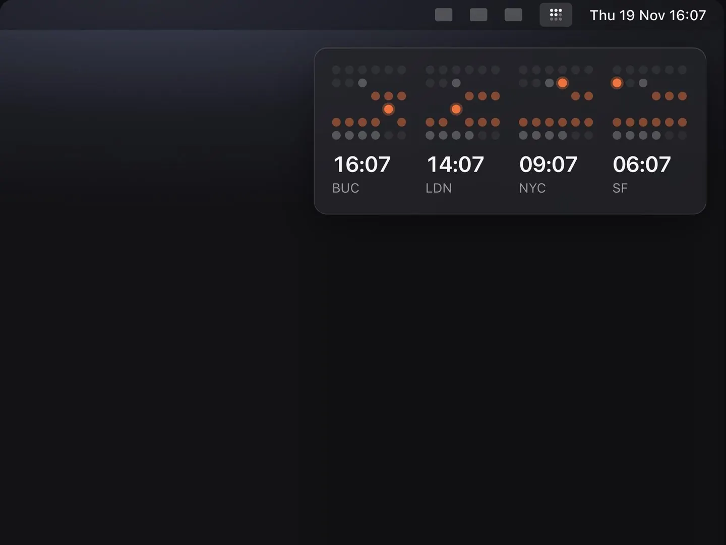
I started by answering the wrong question.
On day one, Claude Code and I built eight working interfaces, live in my menu bar. All looked awesome at first glance, but they felt too complex and way too “tech”, digital if you will.
“This is way too techy. Let’s try something analog.”
Me, looking at all eight.
The designs were sweet, but the job was wrong. I don’t open a menu-bar app to plan; I open it to check, on the way to typing a message. (Detour much?!)
So I built four more for a glance: skies, one clock face, plain sentences, a dot matrix. The skies looked promising.
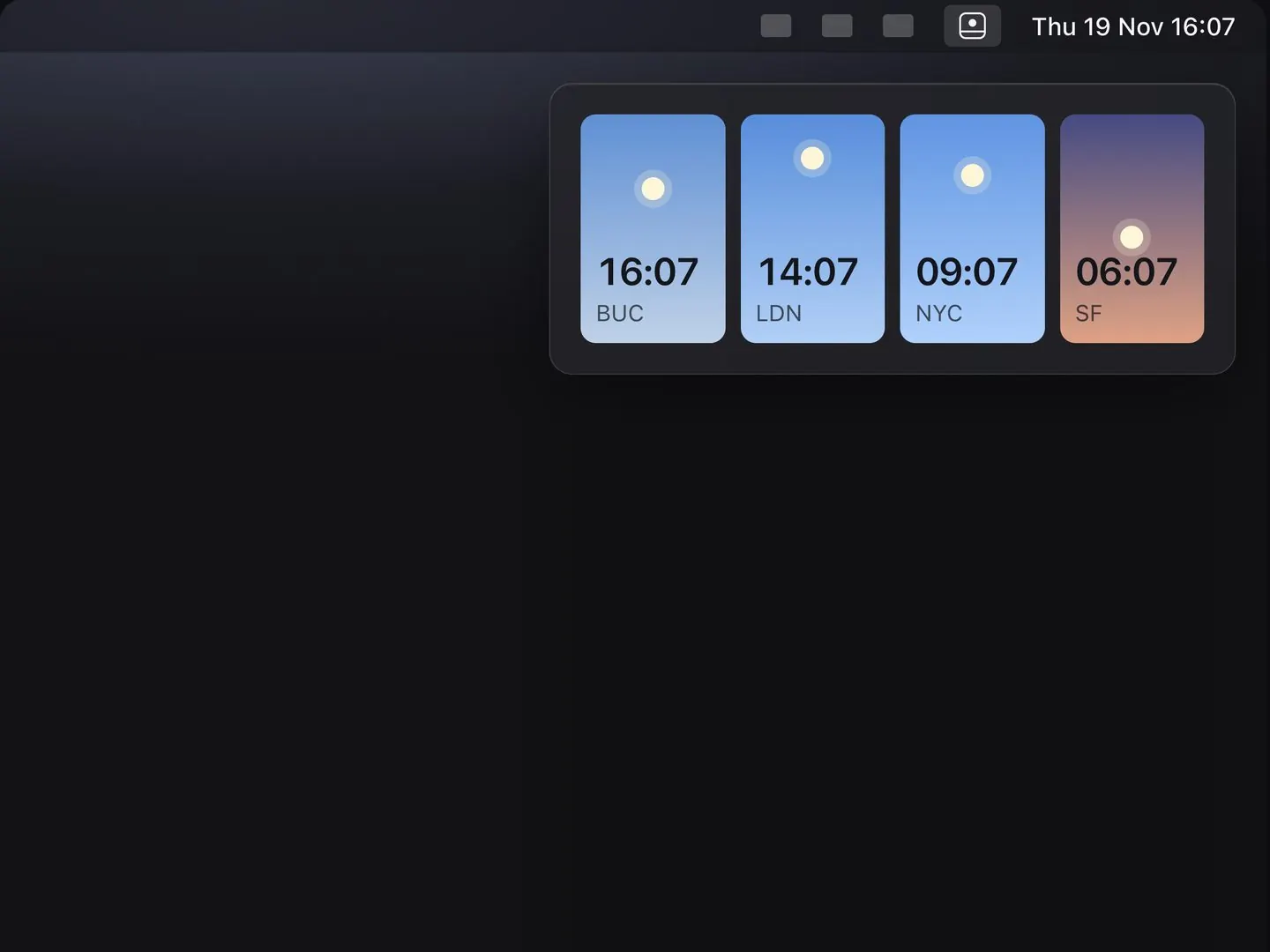
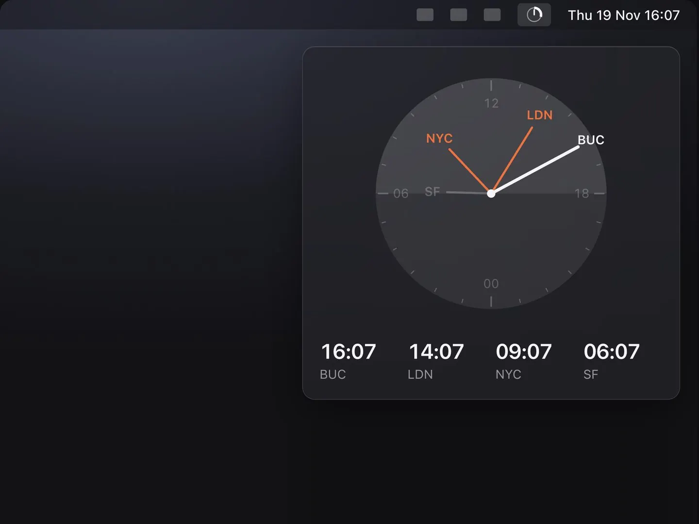
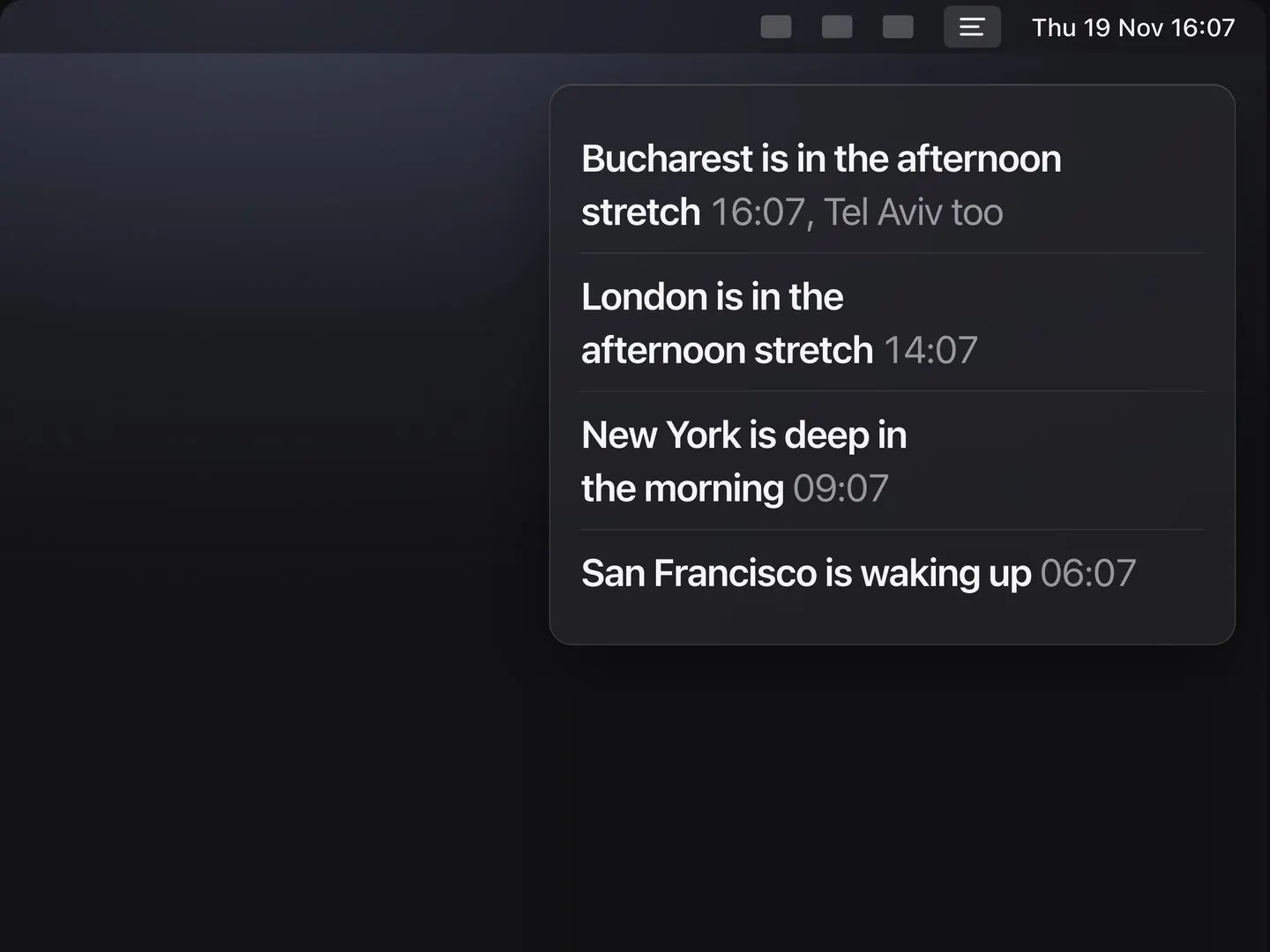
A glance is a picture.
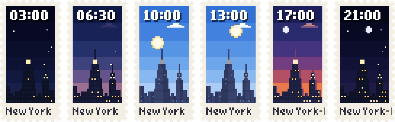
A number has to be read, converted, then judged. A sky is judged before you know you’ve looked. Try it:
The idea took an afternoon. The picture took three tries. First, pixel stamps. My verdict: “pixel stamps don’t look great.”
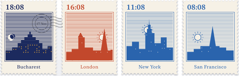
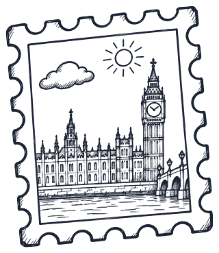
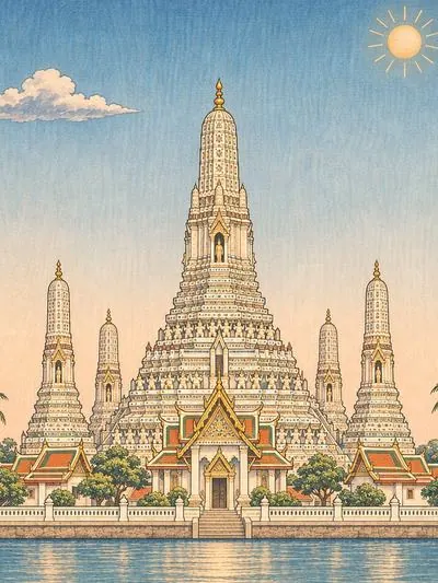
Try three: I stopped drawing by hand. London in eight print styles, to find one that holds a whole day of light at thumbnail size.
Six pictures are an illustration job. Five rules make a system.
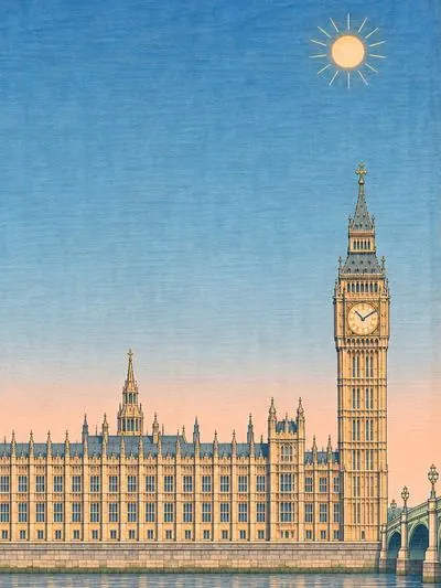
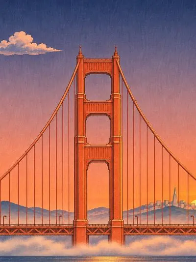
Shin-hanga, the Japanese woodblock revival of the 1900s: flat shapes, a graded sky, one clear subject. It works small and it already knows dusk. I gave it rules, so a seventh city is more of the same.
One master drawing per city.
Only the light changes.
One ground line.
A row reads as one street.
Light comes from the real sun.
No “evening starts at six”.
Words stay on the paper.
Nothing is printed on the sky.
No print yet? More are coming
It gets a sky, the same sun, and its name.
 REYKJAVÍK
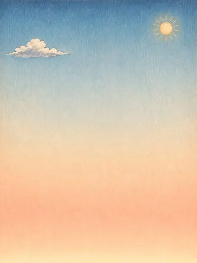 LIMA
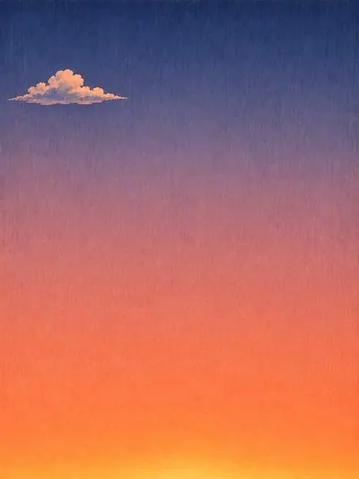 NAIROBI
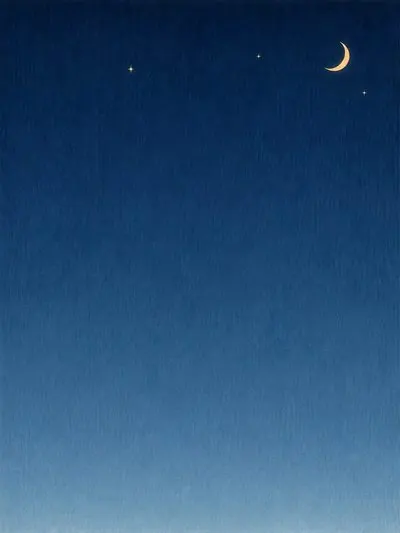 AUCKLAND
The blank one is yours: type a city.
Day two was all about sweating the details.
A system gets you to 80% in a morning. The rest is staring at one stamp too long. London took three drawings; my note on the second: “less water?”
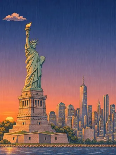
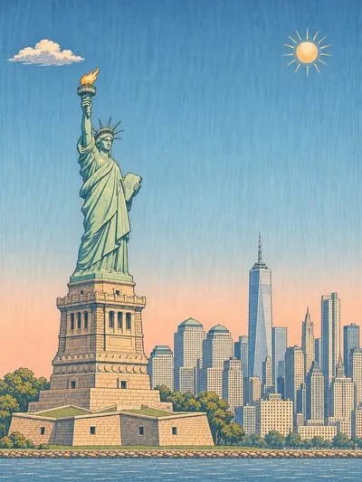
New York took five. Liberty worked once the camera backed off to a ferry and zoomed in.
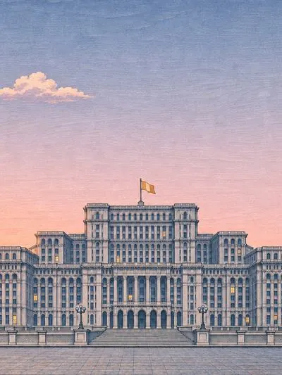
The postmark kept landing on New York’s skyline, so New York cancels on the left. Bucharest’s sky was a shade too blue, so I regraded it.
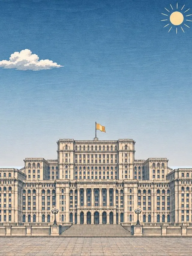
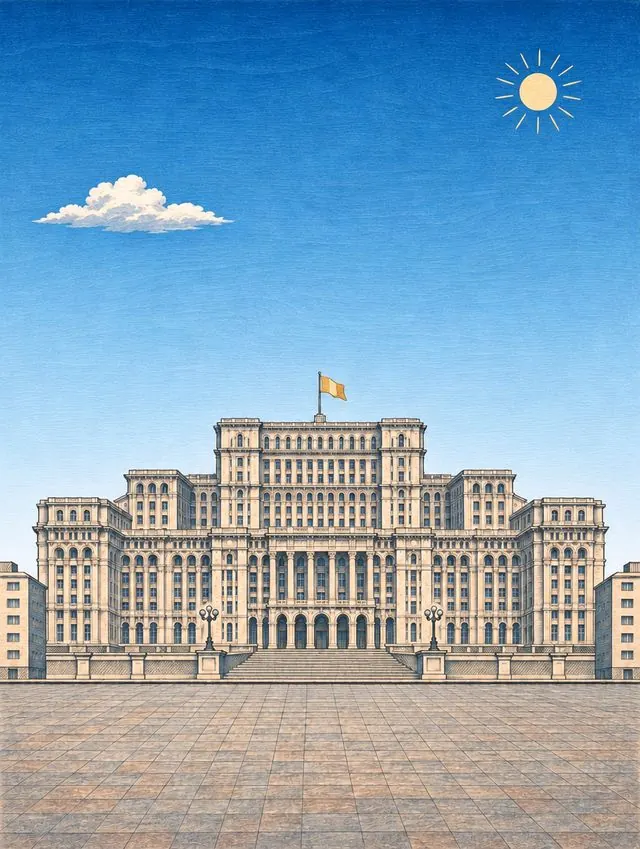
Drag across Bucharest.
- Status wordsCut “
awake”. The amber dot says it. - Body type16 down to 14. The stamps are the content.
- The tiltAn open stamp leans 6° toward your pointer. I asked for the sheen to be “more subtle.” Hover a stamp up top.
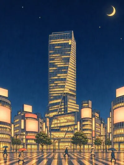
What it doesn’t do is also by design.
Each of these came off the table. Something I check twenty times a day has to stay quiet.
- A nudge when someone starts workI came to check. It shouldn’t come to me.
- A count in the menu bar“Too much noise.”
- People instead of citiesA sky belongs to a place. Faces would make it a contact list.
- The real sun and moon position“Not worth the credits right now.”
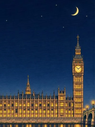
And one thing it didn’t need, but got.
The first six cities have a five-second loop, day and night, so a stamp is never quite still.
More on the way.